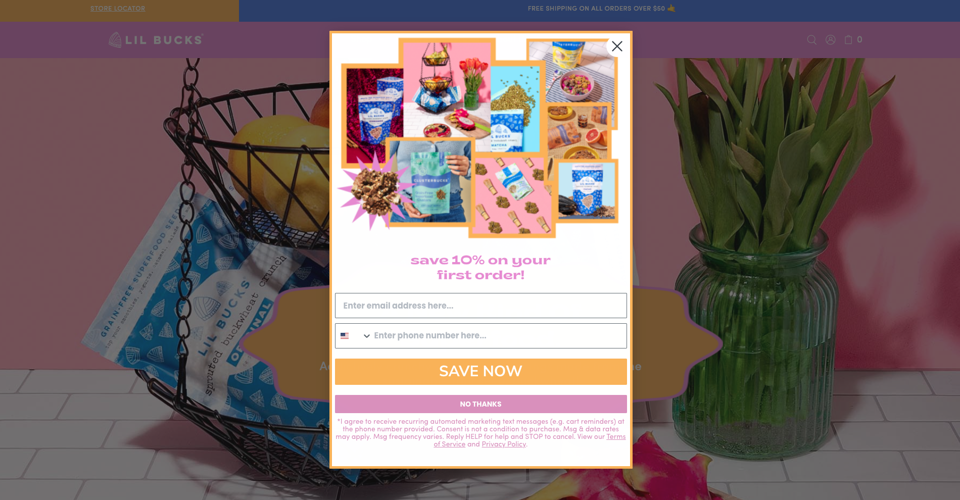
 A solid lead generation strategy is crucial for visibility, credibility, and interest from potential customers. Utilizing lead capture allows customers to provide their information on their terms. Focusing on capturing leads from high-quality prospects can turn them into high-value customers. While there are many ways to collect subscribers and grow your list, pop-up forms have proven the most effective way to capture leads. Read more to find out what makes a pop-up convert.
To launch a sign-up form that converts you need to know the different types, what the best practices are in terms of design, content, and targeting, and how to optimize your pop-up form for mobile.
Types of Pop-Ups
The most popular forms of pop-ups include welcome, exit, scroll, time-based, and interaction-based. While these are all effective, there are proper use cases to capture your audience in the best way.
Welcome Pop-Up
- A welcome pop-up launches when a visitor first arrives on your website. For the welcome, it is important to have it trigger within 4 seconds so that you do not miss out on that customer. These are generally the most used pop-ups that garner conversions.
Exit Pop-Up
- This triggers when a visitor hovers over the top of the page (where a user can close the tab). The intent is to capture the customer before they exit. It is estimated that 10 to 15 percent of lost visitors can be “saved” by using exit-intent pop-ups.¹ So, if your brand is seeing visitors exit shortly after visiting the site it might be good to test using an exit-intent pop-up.
Scroll-based Pop-Up
- This appears after someone scrolls to a specific part of the page. Sleeknote has found that “pop-ups that are shown when a visitor scrolled 35% of a page convert better than pop-ups that are shown before or after.” ²
Time-based Pop-Up
- This is triggered after a certain amount of time has been spent on the page. If you see that visitors spend ample time on a page, it is best to trigger a pop-up before eight seconds because those tend to perform better.³
Interaction-based Pop-Up
- When a visitor lands on a specific page or clicks a certain category, you can trigger a pop-up related to that page or category. These are good to trigger if you want to offer a discount or insight on a certain product or category.
Choosing the right type of pop-up for your customer is extremely important to ensure you are catching them at the right time and place.
Pop-Up Best Practices
The way you design your pop-up has huge implications on if a customer wants to give you access to their personal information. We have curated a few best practices around design, content, copy, and targeting that we have found to be beneficial for our clients, but remember to continue to test as no two customer bases are the same.
Design
- As you’re designing your form ensure that it amplifies a product, and includes decorative elements and shapes that catch your visitor’s eye but do not compete with the essential information.
- Include a lifestyle or product image to show how a visitor would use the product or what they should be looking forward to if they become a customer.
- Pop-ups with images convert better than pop-ups without by 84%.⁴
- Ensure that you separate your design into clear sections, like a landing page, with a header, body copy, and a clear CTA.
Content
- Follow brand guidelines -you don’t want your pop-up to alarm visitors or compete with your branding.
- Try out multi-step! Having a form that has an email and SMS block in the first step, and follow-up questions in the second can lead to further interest and submissions. Pop-ups that have a second step see a staggering 76% of their subscribers input more information.⁵
Copy
- Use your body text to inspire action. Be brief and avoid stuffy language. Be sure to use this space to show off your brand’s personality in a light-hearted way.
Targeting
- Set up your trigger point. Where and when do you want it to appear? How many pop-ups are you planning on triggering on your site?
- Provide value to your customers by ensuring that you are not overloading them with information and triggering pop-ups to the appropriate audiences at the appropriate times.
- Use your data to create segments around what products people are interested in, how often they want to hear from you, etc.
- Utilize teasers to get visitors back into the sign-up form.
Mobile Pop-Up Optimizations
One of the most important practices in regards to sign-up forms is optimizing for mobile. According to Statista, web traffic from mobile devices accounted for over 50% of all web traffic.⁶ For mobile, you want to ensure that your pop-up is thin and tall and that the CTA is large enough for a finger to click it. Your text should be legible, so limit the information you are including on a single page. Additionally, ensure a user can easily exit out and that sticky headers and footers do not get in the way. Utilizing Klaviyo’s sign-up forms makes this process seamless by having the ability to view desktop and mobile in one editor.
Pop-ups are an incredibly powerful tool for lead capture, and one that we find is not often optimized. As the importance of zero-party data grows you will want to make lead capture a priority, and we hope these tips will help you optimize your strategy!
{{cta(‘a’)}}
Sources:


